Compatible with modules from CS-Cart
The vast majority of modules out of the box have been rewritten to fit the theme and are displayed correctly. If you missed a module, write it and we will adapt it in the next theme update.
Compatible with modules from third-party developers
Modules that do not change their appearance will work correctly.
If the module changes its appearance, it is necessary to check with the module developer.
List of changes
1 . Added 2 layouts for the product page
1.1 Grid with images - view
1.2 Big picture — view
2. The Shopping Cart page has been updated
2.1. The product cards in the shopping cart have been redesigned so that information about the product, seller, etc. has a modern appearance.
2.2 The block with information about the order and promotions was moved to the right.
3. The “Checkout” page has been updated
3.1 The selection of the delivery method and payment method have been redesigned in the list.
3.2 All information about the order has been placed in the block on the right.
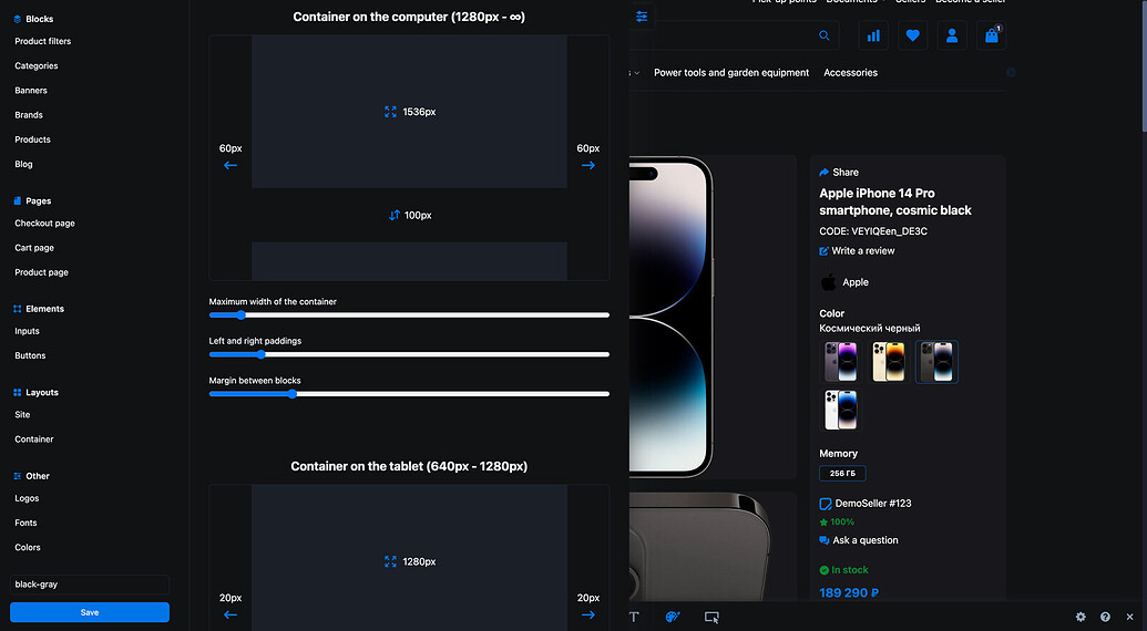
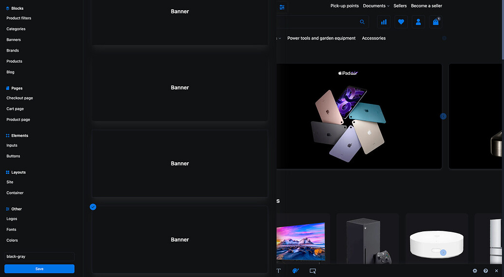
4. Scrollers have been updated for the “Banners”, “Products”, “Categories”, “Subcategories”, “Blog” and “Brands” blocks
4.1 For the “Banners” and “Blog” blocks, you can specify the number of elements that will be visible on your phone, tablet and PC.
4.2 For the “Products”, “Categories” and “Brands” blocks, you can specify the width of the element that will be on the phone, tablet and PC.
For example, if you specify on the PC that the width of the product card will be 200, then:
~ 5 product cards will be visible on the 1200px screen.
~ 7 product cards will be visible on the 1600px screen.
This is done so that the elements look proportionally on all screen resolutions.
For example, on mobile devices with a small screen resolution, 1.5 product cards will be visible, rather than 2 very small or 1 huge one.
4.3 Now the following and previous elements of the carousel are visible (at the moment this is the default behavior, but if necessary, we will add the ability to disable the visibility of elements).
4.4 In the carousel settings, you can enable “Endless scrolling” so that the first element immediately follows the last one.
When you scroll to the last element, you are not thrown to the beginning of the carousel, the endless scrolling is invisible to the user.
4.5 Updated external navigation for all carousels:
On phones and tablets - dots at the bottom;
On PC — arrows;
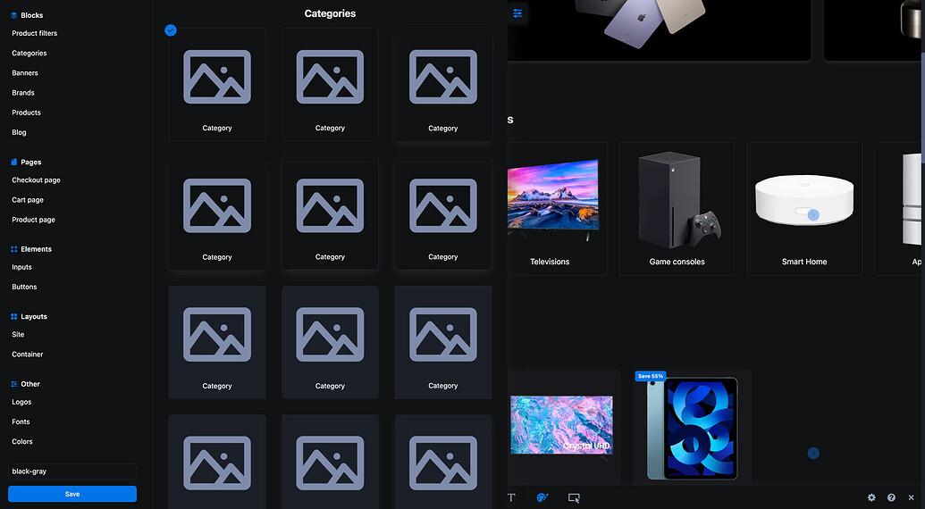
5. Updated grids for the “Banners”, “Categories” and “Subcategories” blocks
5.1 For the “Banners” block, you can specify the number of elements that will be visible on your phone, tablet and PC.
5.2 For the “Categories” and “Subcategories” blocks, you can specify the width of the element that will be on the phone, tablet and PC.
For example, if you specify on the PC that the width of the category will be 200, then:
~ 5 categories will be visible on the 1200px screen.
~ 7 categories will be visible on the 1600px screen.
If the screen is wide, the elements will stretch slightly, if narrow, they will shrink, and if there is not enough space, they will be transferred.
6. The “Subcategories” block has been added
6.1. Subcategories have been placed in a separate block with the ability to configure similarly to the “Categories” block.
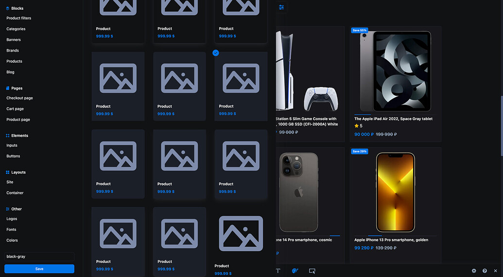
7. The scroller of product images in the catalog and the “Product Grid” block has been updated
7.1. On PC, the scroller works when hovering over the image, and on phones — the usual right/left scroll.
8. Styles
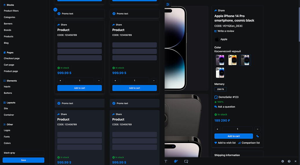
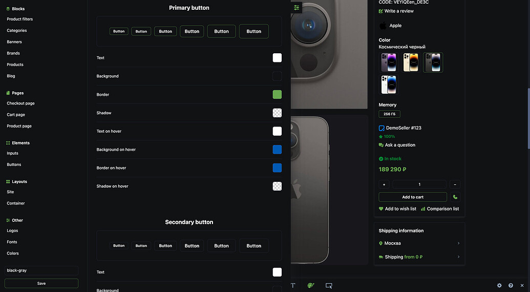
8.1. The theme has 5 styles available: black, blue, red, green and free (Using “Edit style” you can customize the style yourself).
Feedback
We will be glad to hear your feedback to understand what needs to be improved in the next updates.
Demo
https://www.cart.mosuk.ru/demo