Hello. I would like to align the footer in the center.
but the problem is that each change I make, it affect the responsive design.
how can I center that blocks and reduce the space between them only in normal view?

Thanks!
Hello. I would like to align the footer in the center.
but the problem is that each change I make, it affect the responsive design.
how can I center that blocks and reduce the space between them only in normal view?
Thanks!
Hi Rafass,
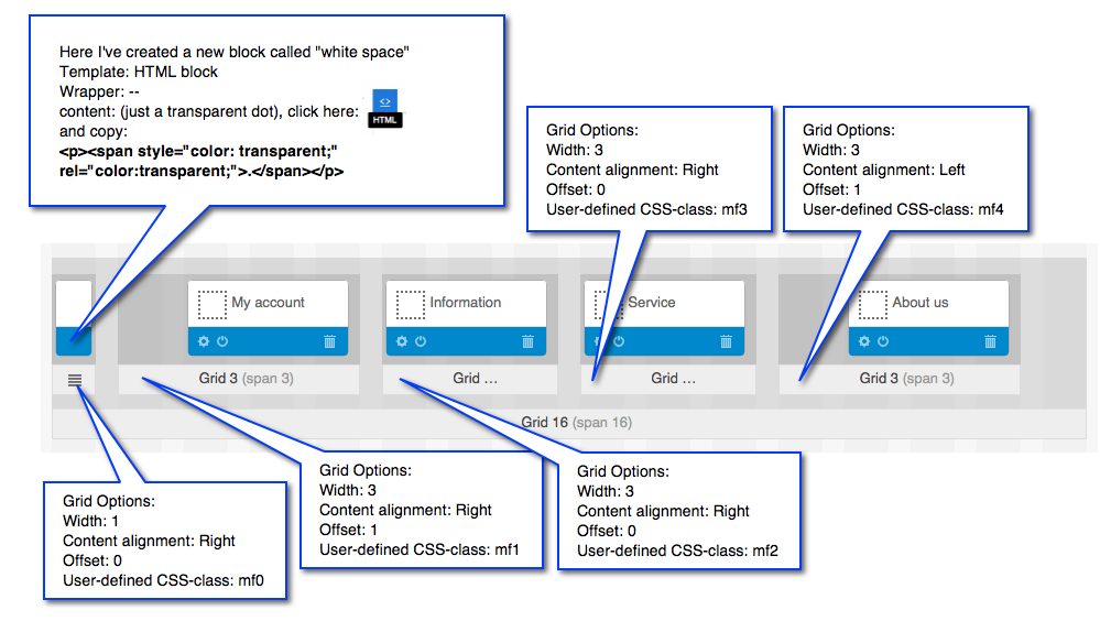
this problem occures when you upgrade(migate) your store from a none responsive to a responsive them. You need to recreate the whole blocks and grids with all their css classes as they are in the cs-car demo in order to achieve this.
just open the admin on demo.cs-cart.com and copy all classes from the blocks n grids in footer, and you will be fine.
Fotis
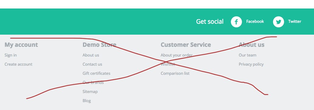
Hello Fotis, I'm running a clean installation and the demo have the footer align to the left:

IMO, the footer can look better in the center and reducing the space between the blocks.
how can I do that without change the responsive design? has been very difficult until now.
Appreciate some help. 8)
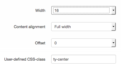
There are 4 grids for these blocks in the Default layout. Please set the Content alignment option to Full width and add the ty-center class to the User-defined CSS-class input.
Note: multiple classes should be separated by space. E.g. "my-account-grid ty-center"
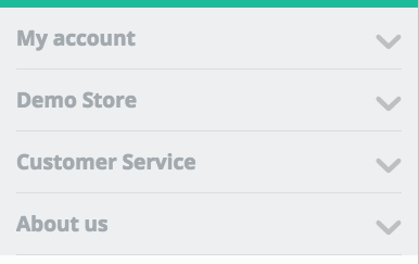
Hello eComLabs! 8)
Following your steps:
And this is the result:
I want to have this result:
Apparently easy with css, but the problem is this in small screens:

:neutral:
With other kind of softwares is easily make changes in the css without affect the responsive design or vice versa
something like:
.
/*normal view
=============================================*/
.your element {
  margin-left: 50px!important;
/mobile devices

=============================================/


@media (max-width:@maxResponsiveNarrowWidth){

.your element {

margin-left: 0!important;}

}
.
Something like that is not possible with cscart? :neutral:
If this is as you dsay a clean installation then there must be something missing.
Normaly if you copy all classes/postitioning for blocks and grids you have to get the same result like in the official demo..
Let me have a url in my pm to get a closer look.
Fotis
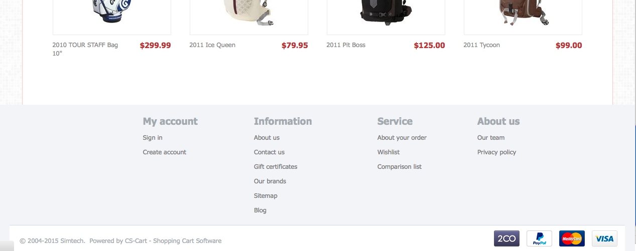
I have the same result of the demo, because is a fresh installation.
I don't like the footer in the left (like in the demo) :
I want to center the blocks like this:
And doesn't change the result in mobile devices.
=====
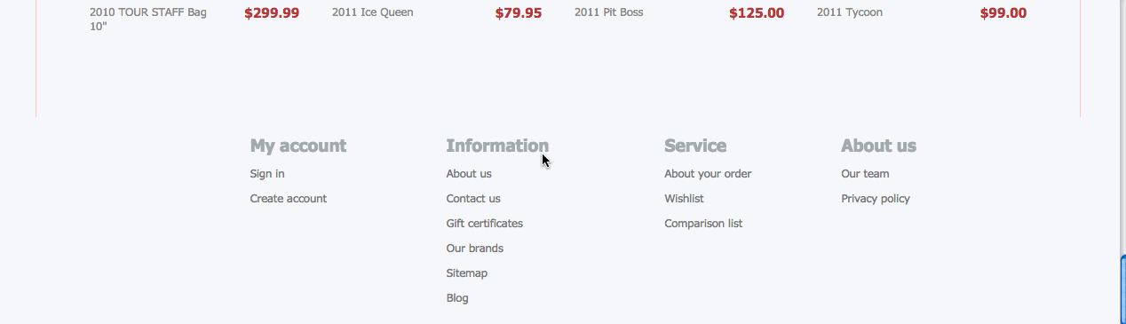
this is the best result I have now:
But I would like to align the links in the left but keep the blocks in the center.
--
@fotis, you have the link in a pm 8) appreciate your help guys.
Nice one
If you like to share for the guys in the forum would be super
Fotis
With other kind of softwares is easily make changes in the css without affect the responsive design or vice versa
something like:
.
/*normal view =============================================*/ .your element { margin-left: 50px!important;/mobile devices
=============================================/
@media (max-width:@maxResponsiveNarrowWidth){
.your element {
margin-left: 0!important;}
}
.
Something like that is not possible with cscart? :neutral:
Yes, it is possible. Please check the current way of realization in the following file:
design\themes\responsive\css\tygh\responsive.less
Nice one
If you like to share for the guys in the forum would be super
Fotis
I'm not sure if is the best way to do this, but at least worked to me:
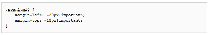
Done 8) xd
Yes, it is possible. Please check the current way of realization in the following file:
design\themes\responsive\css\tygh\responsive.less
That should be the easy way, few codes in the css, but I don't know how. Would be great if you can provide some example, like mine. 8)