Cart-Power: First Theme

Dear friends,

We are glad to inform you that have released new CS-Cart theme – First theme.

CS-Cart “First” theme is an dynamic and stylish responsive theme for your CS-Cart store with interesting and practical design solutions applied. We have added a lot of useful features during realization. CS-Cart “First” theme makes your store looking more inviting and user-friendly, as we enlarged the size of product thumbnails and used light colors. This theme will help you to make your shop more beautiful and practical for your customers.

We recommend you see the video that we have prepared especially for this theme.

GENERAL FUTURES:

  • Responsive theme;
  • Big beautiful general slider with parallax effect;
  • Enlarge size of product thumbnails;
  • Blocks are animated and configurable;
  • Top panel and top menu are floating;
  • Based on CSS3 and HTML5;
  • Set icons FontAwesome and Typicons;
  • CSS3 animation for active elements;
  • Beautiful label and notification;
  • Tags cloud is stylized.

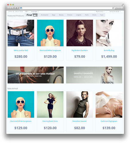
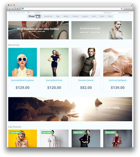
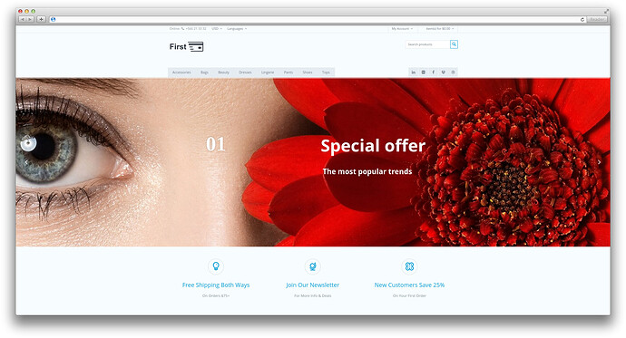
Homepage:


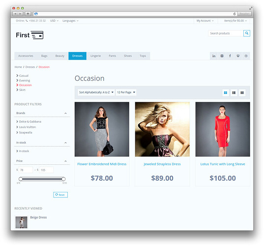
Page of categories:


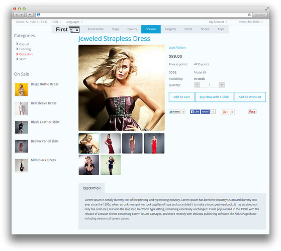
Detailed product page:


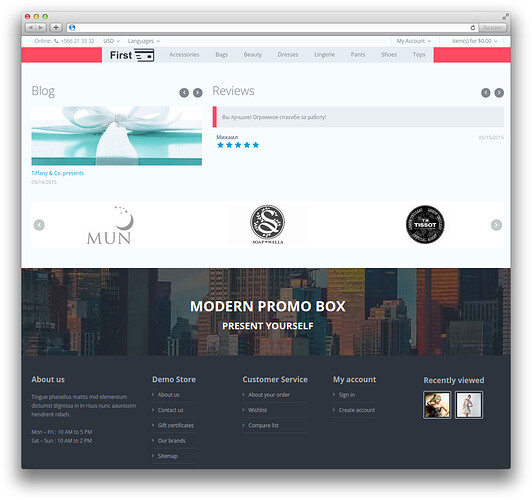
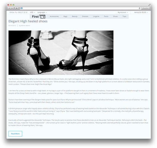
Page of Blog:


Demo is available:

Compatibility:

Product: CS-Cart;
Compatibility versions: 4.2.x, 4.3.x;

Please, do not hesitate contact us if you have any additional questions.

Official product page is here.

Thank you for the your time.

can you please make a addon for just the parallax effects?

[quote name='Kayokoko Swimwear' timestamp='1433418972' post='217289']

can you please make a addon for just the parallax effects?

[/quote]


Yes, we will plan to release it in the nearest future

You really should fix the issue with the slider on the demo.

Some feedback.


Top&Header too classic cs-cart. Too much space taking I think. Doesn't

http://www.nike.com/us/en_us/

compact size top look nice and clean?


Category fonts on left just do not look well.

http://demo.cart-power.com/first/index.php?dispatch=categories.view&category_id=19


Grids are not equal height because of the review stars


All this hovering and rotating and moving stuff just do not have a feel of the professional template (product in grid, quick view, add to cart).

IMHO its not as good as your other styles.

I hope to see more styles from you.

Looks very nice to me. But when I view it on a mobile device and tap on an item's photo in a category list, I expect to be brought to the item's detail page. Instead, the photo just fades and displays buttons for add-to-cart, one-click and add to wishlist. I can get to the item's detail page by tapping on the item's textual name, but I figured that out only by experimentation, I'm concerned my site's visitors will be confused by this behavior.

Looks fine, but not ready for production sites. The checkout page needs more work.

Guys,


Thank you very much for your attention to our product. We are really appreciate all your comments.


[quote]

[color=#282828][font=arial, verdana, tahoma, sans-serif]Some feedback.[/font][/color]

[color=#282828][font=arial, verdana, tahoma, sans-serif]Top&Header too classic cs-cart. Too much space taking I think. Doesn't[/font][/color]

[url=“http://www.nike.com/us/en_us/”]http://www.nike.com/us/en_us/[/url]

[color=#282828][font=arial, verdana, tahoma, sans-serif]compact size top look nice and clean?[/font][/color]

[color=#282828][font=arial, verdana, tahoma, sans-serif]Category fonts on left just do not look well.[/font][/color]

http://demo.cart-pow…&category_id=19

[color=#282828][font=arial, verdana, tahoma, sans-serif]Grids are not equal height because of the review stars[/font][/color]

[color=#282828][font=arial, verdana, tahoma, sans-serif]All this hovering and rotating and moving stuff just do not have a feel of the professional template (product in grid, quick view, add to cart). [/font][/color]

[/quote]


Darius,


Your recommendations are always meaningful and useful. We definitely will taking into account these things.


[quote]

[color=#282828][font=arial, verdana, tahoma, sans-serif]IMHO its not as good as your other styles.[/font][/color]

[color=#282828][font=arial, verdana, tahoma, sans-serif]I hope to see more styles from you. [/font][/color]

[/quote]


Can you please describe more detailed what exactly you don't like if it is possible? We will do all our best to improve our product.


[quote]

[color=#282828][font=arial, verdana, tahoma, sans-serif]Looks very nice to me. But when I view it on a mobile device and tap on an item's photo in a category list, I expect to be brought to the item's detail page. Instead, the photo just fades and displays buttons for add-to-cart, one-click and add to wishlist. I can get to the item's detail page by tapping on the item's textual name, but I figured that out only by experimentation, I'm concerned my site's visitors will be confused by this behavior. [/font][/color]

[/quote]


Yes, you're right. We guess, we will add ability to change this way of displaying to next release. Thank you for your help.


[quote]

[color=#282828][font=arial, verdana, tahoma, sans-serif]Looks fine, but not ready for production sites. The checkout page needs more work. [/font][/color]

[/quote]


Can you please describe what you think needed to change with checkout? Any recommendations are really appreciated.


Thank for you help guys and thanks again that you participate in the discussion.
[quote name='Cart-Power' timestamp='1433663546' post='217656']

Can you please describe more detailed what exactly you don't like if it is possible? We will do all our best to improve our product.

[/quote]

I mostly agree with Darius comment that its too classic CSC, My first general impression is that it does not stand out as a custom style as it resembles CSC stock style too much. This is partly due to the color choices, styling elements and the use of superfluous space.


There are many nice js effects in the style.


But asides from this what I mostly miss is harmony and consistency in the design. If you scroll down the home page it goes from one color scheme to the next. Some elements have rounded colors, while other have sharp edges. It seems that the main consistency is inconsistency. Every element seems to come from a different design. When looking at elements closely I see color schemes and forms that would work nicely if you base a full design on it.


Normally when I evaluate a design I can shoot at details but with this design I simply do not 'get it'. There is no accounting for taste though.