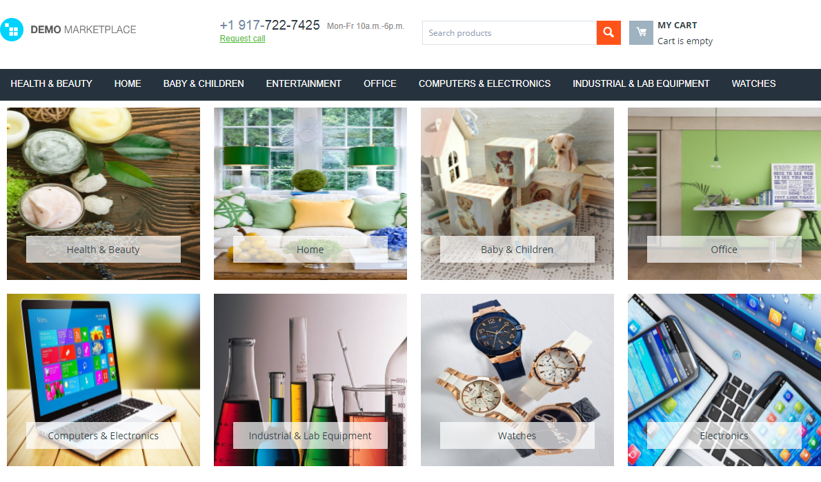
I am glad to present you the Category Gallery add-on. It allows you to create layout blocks with beautiful category images in one minute. The add-on provides 2 additional templates for category display. These templates are Grid and Scroller.
Providing visual content for categories, you make it easy to find the right category from the start. Main categories within tiles also simplify the shopping for tablet or smartphone users. Thus, you create a better customer experience and encourage customers to move deeper into the site.
Eye-catching images for categories is already a long standing trend in ecommerce. The largest players like Amazon and Etsy have already appreciated it and used it to their advantage. You can do the same.
Key features:
- Grid and scroller templates for categories;
- Configurable scrolling;
- Main categories in tiles;
- Fully responsive templates for category gallery;
- Different category galleries for different pages.
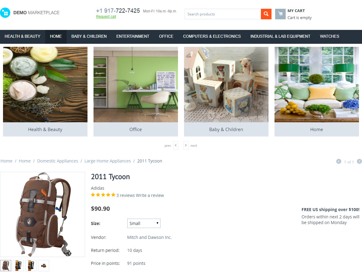
We have added the "Subcategories" template for the block content that displays subcategories nested one level lower from the current one. You can place it in your category page to display the subcategories.
Category Gallery add-on allows you to crate beautiful grid and scroller templates for categories.
The height of the categories block was fixed in the Category Gallery add-on. Now the aspect ratio of block depends on image sizes that are inside the block. Settings > Thumbnails > "Categories list thumbnail width" and "Categories list thumbnail height" settings are used there.
Previously, category columns were distorted. We made a study and found out that the issue was caused by extra spaces. After resetting the font size for the container to zero, we managed to resolve the issue. Now, the grid is displayed correctly.
One of our customers reported that the buttons for switching categories in the category gallery do not work in the mobile version of the store. The issue was solved by canceling the zeroing of indents for the OWL carousel.